Four years ago I wrote a post about the Baskerville typeface, Of course my post had to be titled The Font of the Baskervilles; I had no choice. And now we have an entire book called Baskerville, subtitled The Biography of a Typeface, by Simon Garfield. You may remember Garfield from another post of mine — from April 1, 2012 — but probably not.
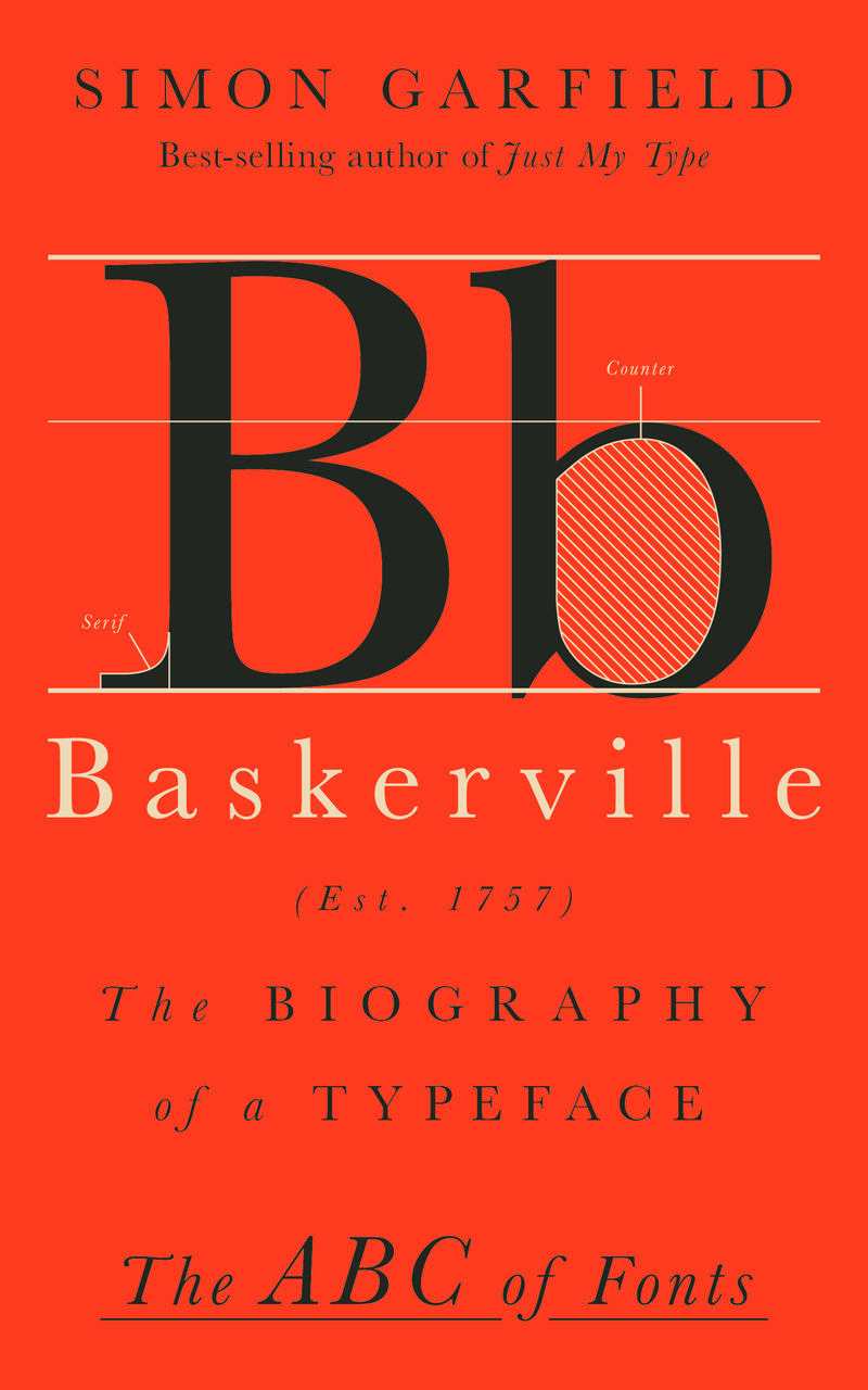
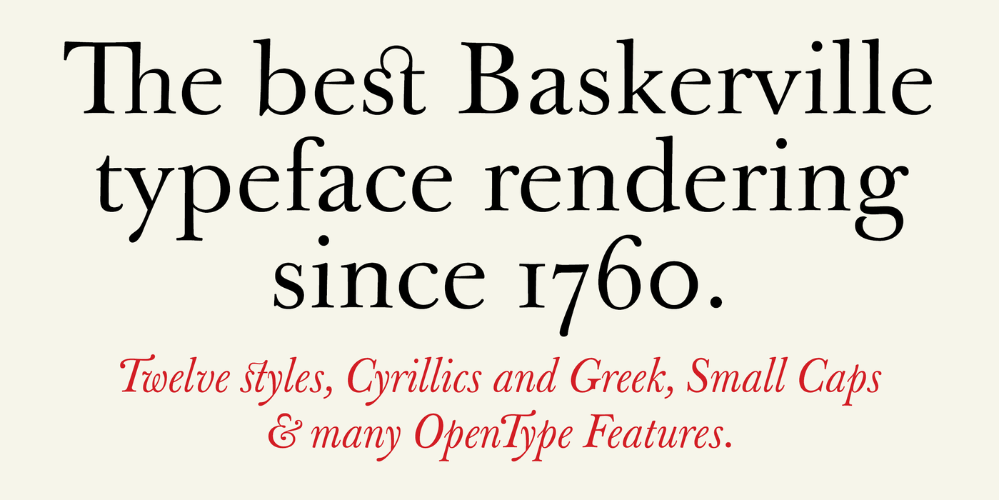
Anyway, another thing you may find hard to believe is that it’s even possible to write an entire book about a single font! What’s so special about Baskerville? If you’re unfamiliar with this font, just examine these two images: the cover of the book and a special sample that includes an unusual “st” ligature. When I first met my friend Brian, he quickly convinced me that Baskerville should be my favorite typeface, and so it remains today (despite these posts). But that still doesn’t explain how one writes an entire book — albeit a small one — about a single typeface.
The answer is that Garfield didn’t really write an entire book about one typeface. What he really did was write a story, a story about John Baskerville and the intellectual context of the late 18th to early 19th Century. It took him approximately forever to design his typeface, largely because of what Garfield characterizes as Baskerville’s perfectionism:
Baskerville would soon benefit from having his work judged as a new art form in itself, rather than an accompaniment to it. “His types and typography,” reasons Bidwell, “upheld the principles of purity, poise, harmony and restraint.”
As with most successful books about technical matters, this isn’t really a technical explanation about a typeface; it’s a story about human beings. Go read it!
Categories: Books, Life, Teaching & Learning
